Muuling.
Jun 2023 - Sep 2023
Brand Identity Development
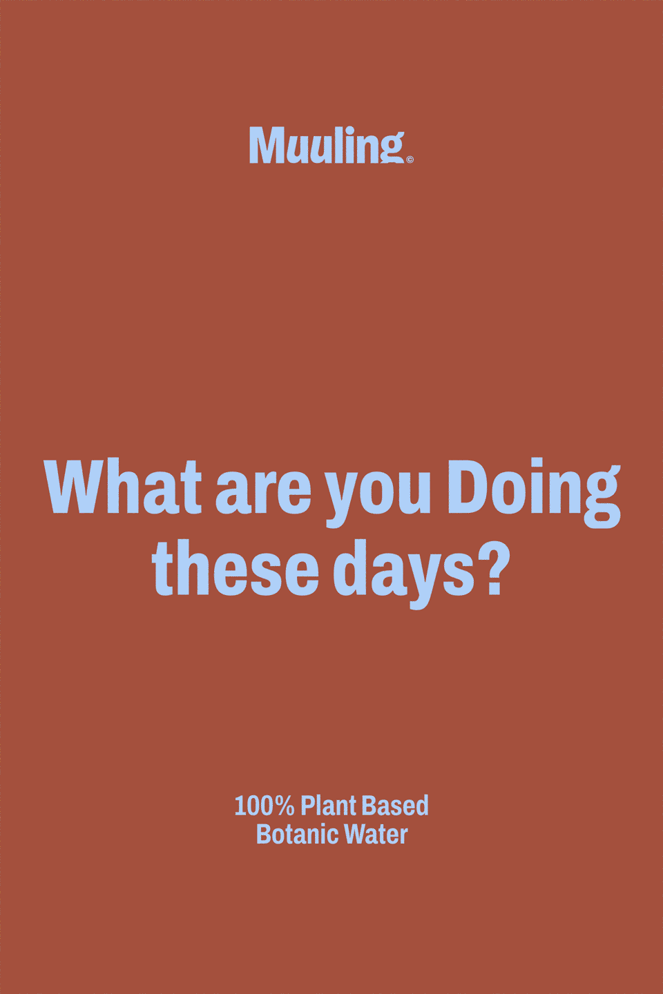
Muuling is a botanical water brand that proposes a healthy hydration habit for modern individuals, by strictly avoiding the use of artificial additives such as alternative sweeteners and preservatives, and delivering natural botanical ingredients from around the world in the form of a rapidly absorbable liquid. To aid the brand offer a health-conscious and stylish lifestyle for hydration under the motto ‘Most Unique & Ultimate Liquid”, we re-established the brand’s strategy and form to secure a distinctive competitive edge in the market.
뮬링은 대체 감미료와 보존제 등 인공 첨가물은 일절 사용하지 않고, 세계 곳곳의 다양한 과일과 식물에서 추출한 천연 성분만을 활용하여 신체 내 흡수가 가장 빠른 액상의 형태로 현대인에게 건강한 수분 섭취 습관을 제안하는 보타닉 워터 브랜드입니다. ‘Most Unique & Ultimate Liquid’라는 의미를 담아 건강한 수분 보충 문화와 스타일리시한 수분 섭취 라이프스타일을 제안하고자 하는 브랜드를 위해, 유사 카테고리 시장에서 차별화된 경쟁력을 확보할 수 있도록 전략 및 정체성 시각화에 대한 프로젝트를 진행했습니다.
Design Principle
In contrast to supplements that solely focus on health or teas only driven by taste, Muuling emphasizes the cultivation of a healthy hydration habit by a daily consumption of water. As a lifestyle brand actively harnessing the power of nature, Muuling critiques the stimulating flavors and aromas of high-sugar drinks with its distinctive yet delightful grammar. Muuling integrates the habit of incorporating the power of nature into its brand design, to intuitively convey its firm brand identity and message.
뮬링은 단순히 건강을 위한 영양제나 취향을 앞세우는 향료 차가 아닙니다. 매일매일 하루 한잔 채워가는 건강한 수분 섭취에 대한 습관 강조하며, 자연의 힘을 적극적으로 지지하는 라이프스타일 브랜드입니다. 고당도 음료들이 가진 자극적인 맛과 향료들을 대중들이 공감할 수 있는 뮬링만의 유쾌한 어법으로 부정합니다. 자연이 가진 힘을 내 몸 깊숙이 흡수 시킬 수 있도록 매일의 습관을 시각적 언어로 로고에 적용하여 브랜드가 추구하 는 메시지를 직관적으로 전달할 수 있도록 설계하였습니다.
Brand Logo Design
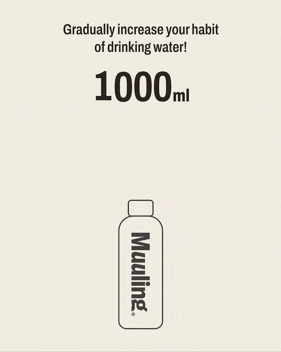
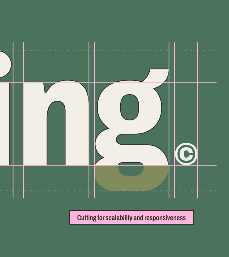
‘Muul’ is a variation of the Korean pronunciation for water ‘Mul,’ and also an acronym for ‘Most Unique 8 Ultimate Liquid.’ In the wordmark, the ‘u’ is depicted as a cup containing water, and is playfully transformed to symbolize the brand’s mission regarding the active repetition of hydration habits. The trailing regular verb [-ingl is also designed with the adjustment of the descender of ‘g,’ ensuring stable placement in various contexts for future use.
물의 한국어 발음 표기 ‘Mu’의 변형이자, ‘Most Unique & Ultimate Liquid’의 약자로 이루어진 ‘Muul’을 활용한 워드마크를 디자인합니다. 물이 담긴 한잔의 컵을 닮은 알파벳 ‘u’를 위트있게 변형하여 반복되는 수분 습관에 대한 의미를 담아 로고에서 브랜드의 미션이 적극적으로 표현 될 수 있도록 디자인합니다. 또한 로고 속 규칙 동사 [-ing]가 이후 그래픽 시스템에서 다양한 환경에서 탄력적으로 반응하는 시스템을 위해, 소문자 ‘g’의 하단 디센더를 조정하여 연제나 안정감 있게 배치될 수 있도록 설계합니다.


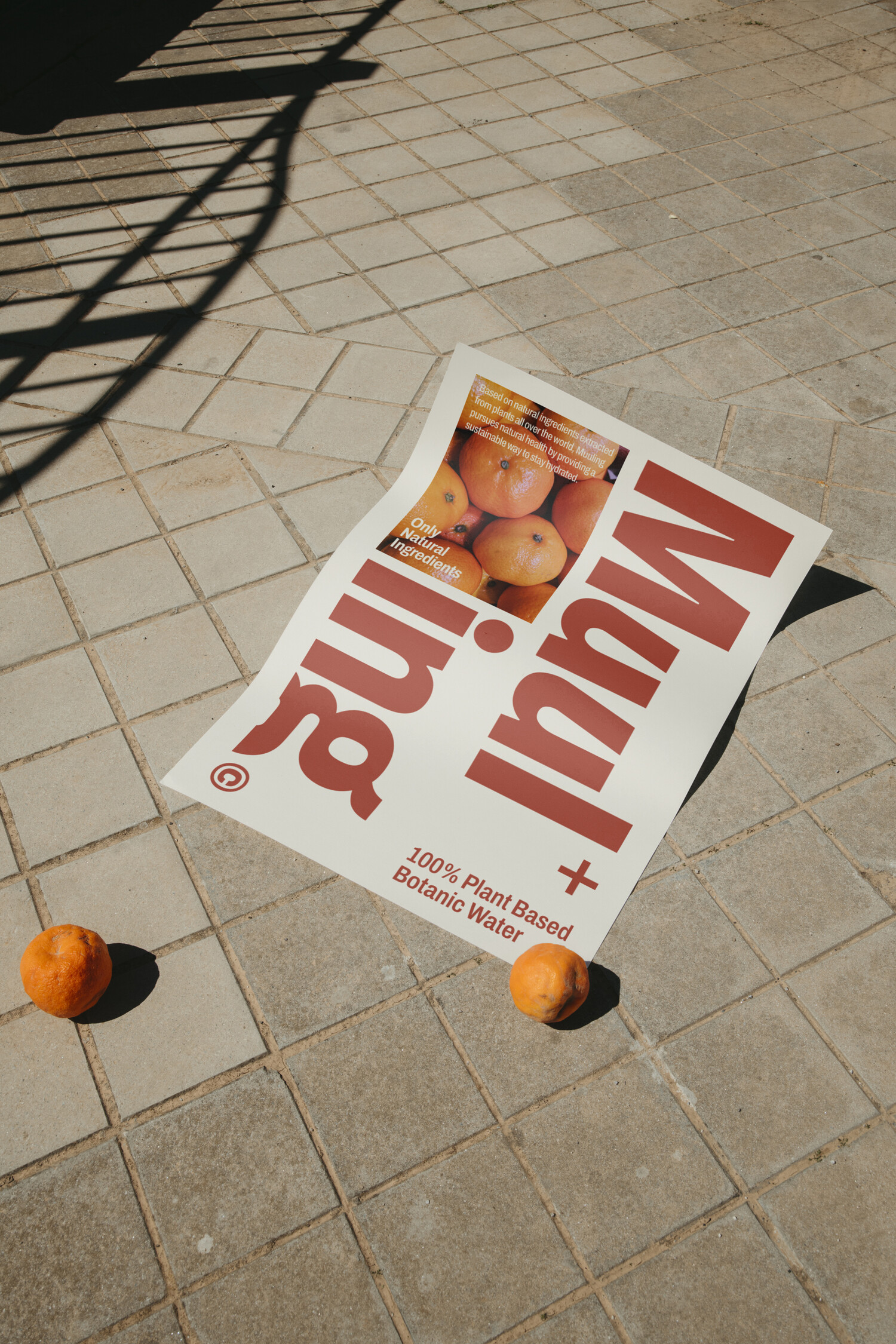
Graphic Style A
: N + ing
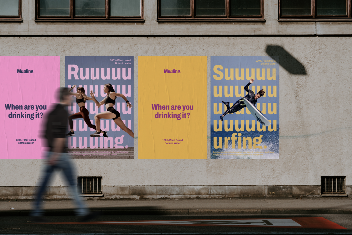
Graphic Style A is the brand’s own visual language that most intuitively utilizes the brand’s naming. It is a graphic grammar that intuitively interprets and substitutes the characteristics of the rule verb [~ing], which means the present progressive, to describe the moment when the brand meets Muuling for healthy water intake in various moments such as daily habits, hobbies, and various exercises.
그래픽 스타일 A는 브랜드의 네이밍을 가장 직관적으로 활용한 브랜드만의 시각언어 입니다. 현재진행형을 의미하는 규칙 동사 [~ing]의 특성을 직관적으로 해석하고 대입하여, 일상의 습관과 취미, 다양한 운동 등 여러 순간 속에서 건강한 수분 섭취를 위해 뮬링을 만나는 순간을 묘사하여 브랜드가 일상속에 함께 하는 모습을 표현하는 그래픽 문법입니다.


Graphic Style B
: Vowel Repetition
Graphic Style B was developed as a grammar that repeatedly uses the alphabet “u” to intuitively express the narrative that implies “a habit of drinking a cup of muuling every day” in the brand logo. The expanding wordmark is then hybridized with various sports and leisure to develop brand-specific communication graphic grammar with graphics in which vowels are repeated. This visual language is actively used on various channels to create consensus and wit in the target that the brand aims for, and to link it to direct participatory promotions from consumers.
그래픽 스타일 B는 브랜드 로고 속 ‘매일 하루 한잔씩 뮬링을 마시는 습관’ 이라는 의미를 내포한 내러티브를 직관적으로 표현하기 위해 알파벳 L’를 반복적으로 활용하는 문법으로 개발되었습니다. 확장되는 워드마크는 이후 다양한 스포츠&레저와 교합되어,모음이 반복되는 그래픽을 통해 브랜드 고유의 커뮤니케이션 그래픽 문법을 개발합니다. 이 같은 시각언어는 브랜드가 지향하는 타겟에 공감대와 위트를 유발하고, 제품을 사용하는 실제 소비자들의 직접적인 참여형 프로모션으로 연계될 수 있도록 다양한 채널에서 적극적으로 활용합니다.