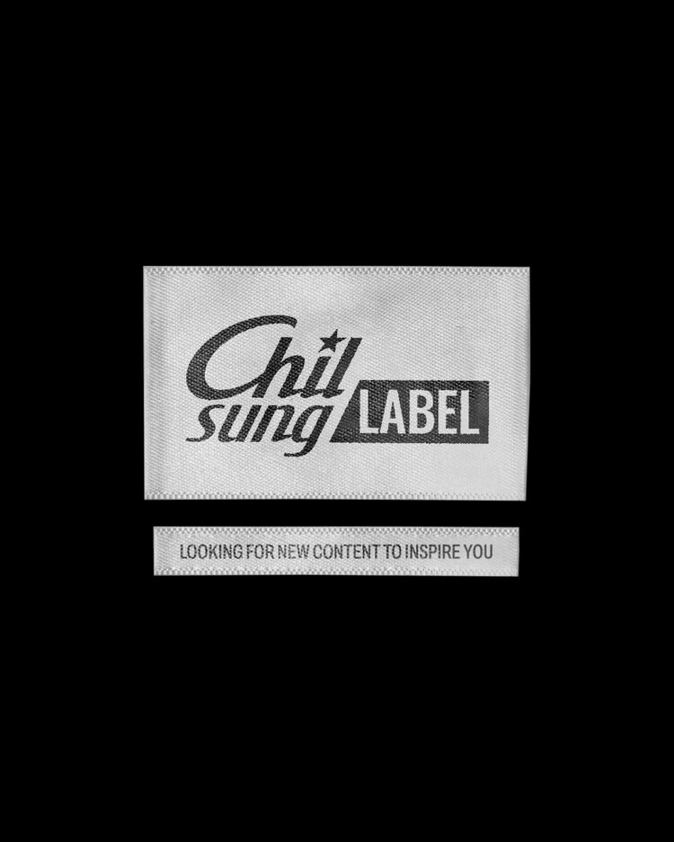
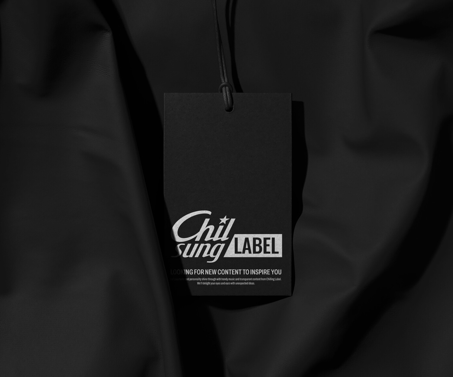
Chilsung LABEL
BrandIdentityDevelopment
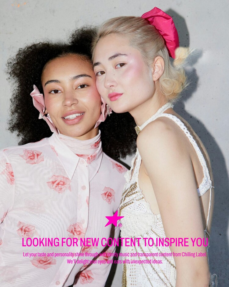
Lotte Chilsung’s entertainment channel ‘Chilsung Label’ is a social media content music label under the content marketing team. Based on the motto of ‘transparency that makes tastes and identity clear’, the label showcases various contents related to music such as records and albums, and has a large number of fans of all ages due to its planning power that is recognized and understood by the public.
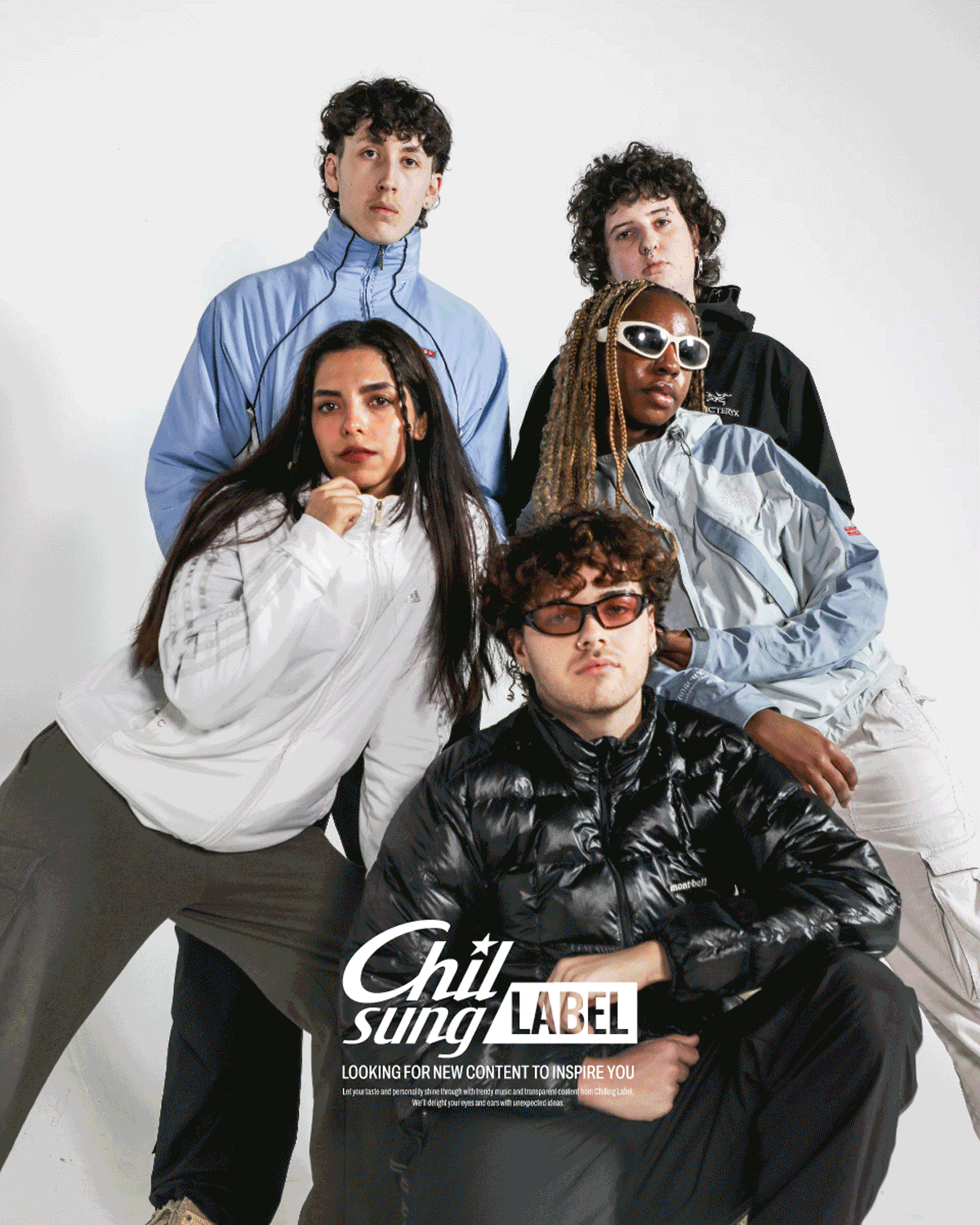
Starting with Instagram and gradually expanding beyond releases and shops to Youtube channels, we want to develop a consistent identity with a more sophisticated brand hierarchy and a systematic graphic system for the label’s brand.
롯데 칠성의 엔터테인먼트 채널 ‘Chilsung Label’은 콘텐츠 마케팅 팀 산하의 SNS 콘텐츠 음악 레이블입니다.
‘취향과 아이덴티티를 선명하게 만들어주는 투명함’이라는 모토를 기반으로 음반, 앨범 등 음악에 관련된 다양한 콘텐츠를
선보이며 대중들에게 인정받고 공감받는 기획력으로 연령대에 제한 없는 많은 팬덤을 보유하고 있습니다.
Instagram을 시작으로 점차 릴스, 샵을 넘어 Youtube채널로 확장되는 레이블 브랜드를 위해
보다 정교한 브랜드 위계 정립과 체계적인 그래픽 시스템으로 일관된 아이덴티티를 개발하고자 합니다.

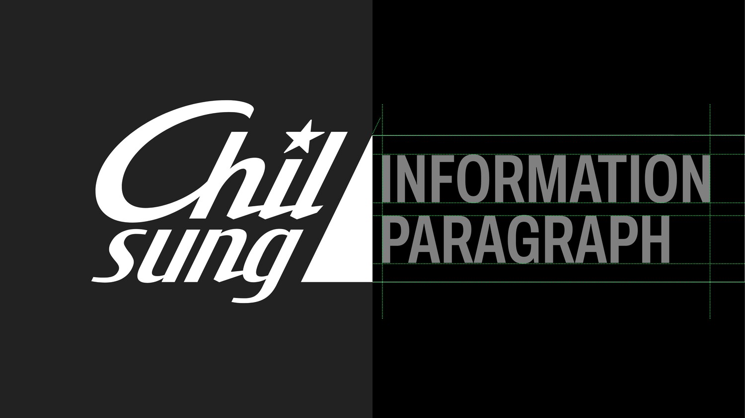
Brand Hierarchy Issues
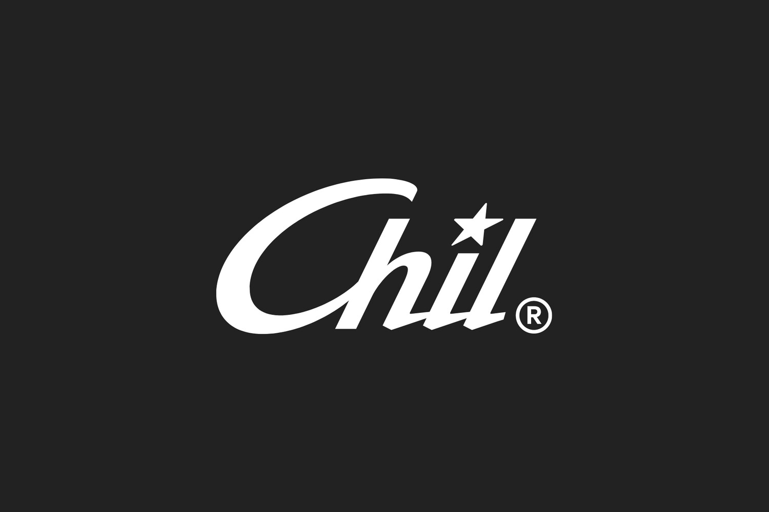
The label mark developed from Lotte Chilsung’s existing ‘Project Chil’ logo was experiencing problems due to similarities that made it difficult to distinguish stylistically across content marks and various resources. Especially in narrow exposure environments such as mobile displays, the company needed a label mark that could be clearly distinguished in consideration of readability.
In addition, we analyzed and developed a visual structure to accomplish this, as the official name of the label was being changed from ‘Chil LABEL’ to ‘Chilsung LABEL’, and it needed to be corrected with a form that could consistently inherit the existing ‘Chilsung’ brand identity.
기존 롯데 칠성의 ‘Project Chil’로고에서 개발된 레이블 마크로 인해 컨텐츠 마크 및 다양한 리소스에서 조형적 구분이 어려운 유사성으로 인한 문제점이 발현되고 있었습니다. 특히 모바일 디스플레이처럼 노출 환경이 협소한 환경이기에 가독성을 고려하여 명확하게 구분이 가능한 레이블 마크를 필요로 하는 상황입니다.
또한 정식 명칭을 ‘Chil LABEL’에서 ‘Chilsung LABEL’로 전환하며, 기존 ‘Chilsung Cider’의 아이덴티티를 일관되게
계승 할 수 있는 조형으로 교정이 필요한 상황이기에 이를 수행하기 위한 시각 구조를 분석하고 개발했습니다.
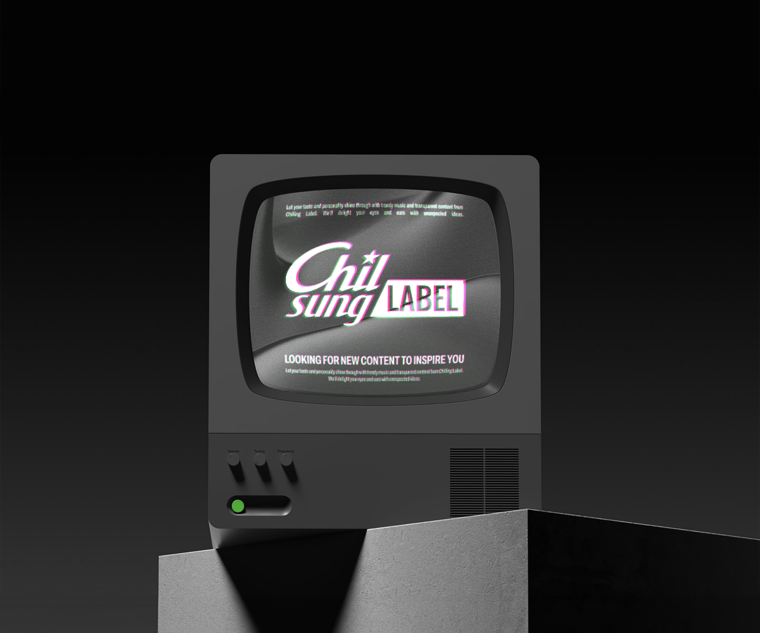
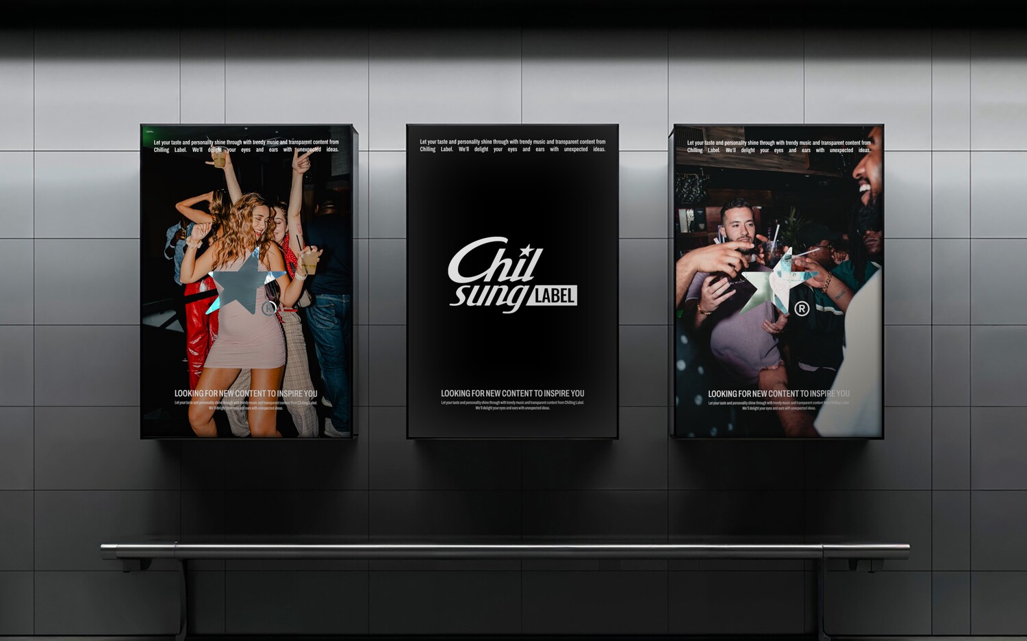
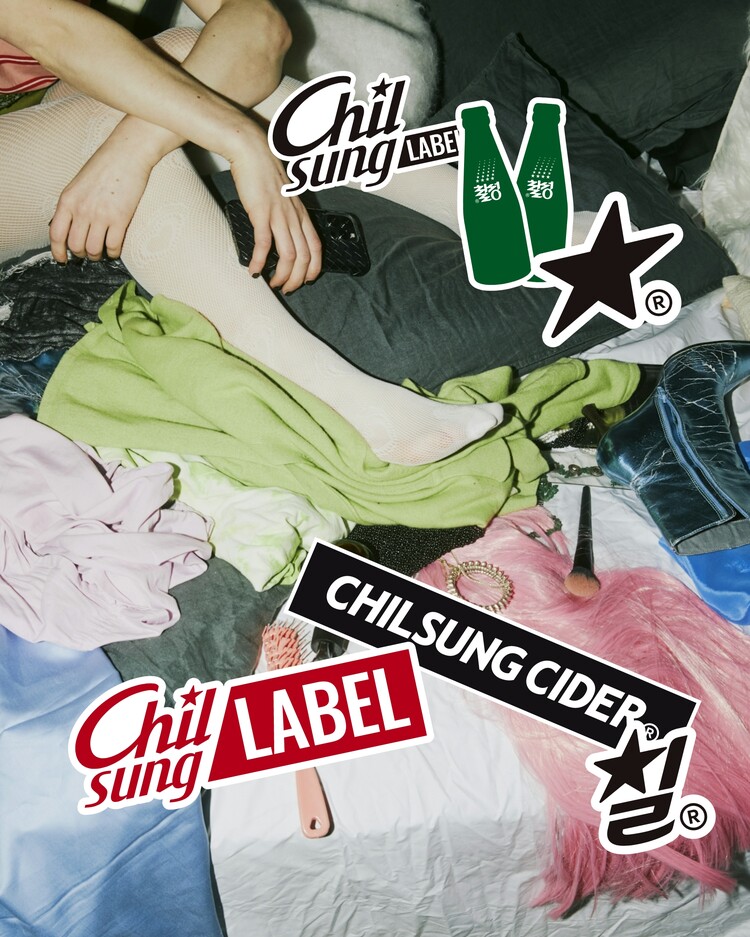
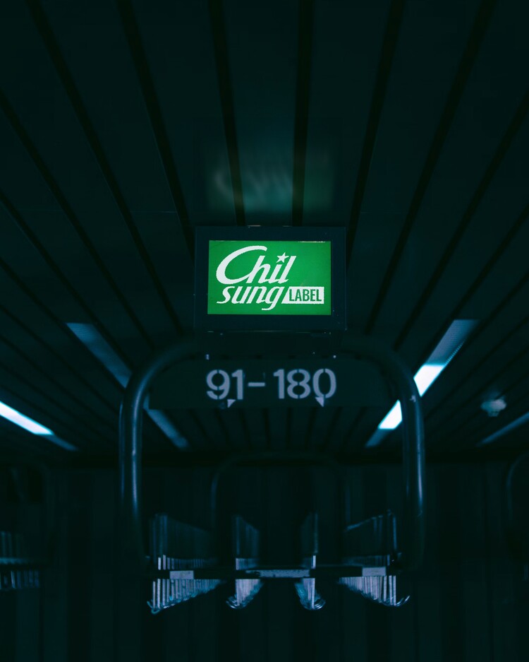
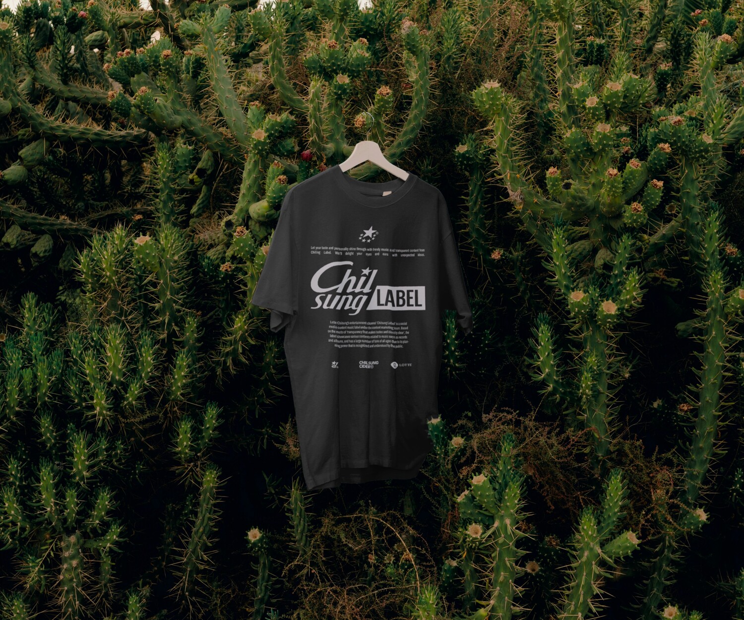
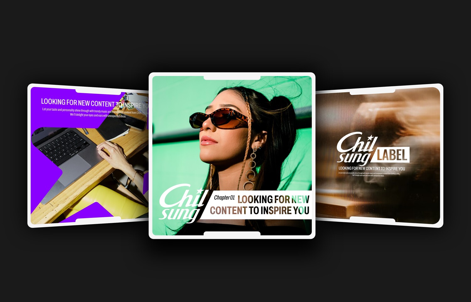
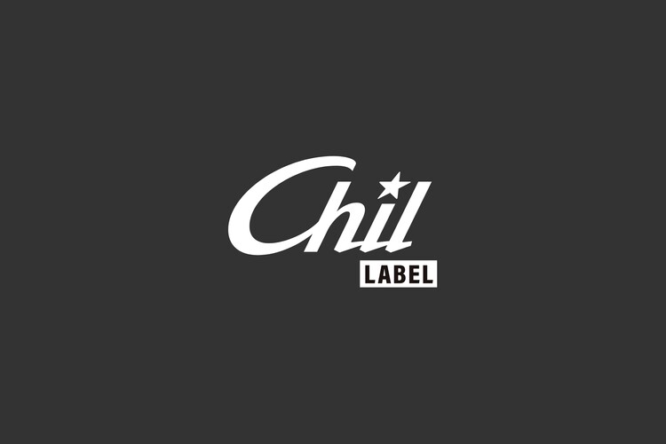
Responsive graphics systems
The newly developed ‘Chilsung LABEL’ brand mark can respond to various shapes and formulations by utilizing content squares while maintaining its own identity. It can respond flexibly to the environment of the target audience, not only by size, but also by the type of information that can be included in the content.
새롭게 개발된 ‘Chilsung LABEL’의 브랜드 마크는 고유의 정체성은 유지된 상태에서 컨텐츠 스퀘어를 활용하여 다양한 형태와 제형으로 반응할 수 있습니다. 크기별 반응은 물론, 컨텐츠의 정보를 담아낼 수 있는 인포메이션 타입까지 표현되는 대상의 환경에 맞춰 탄력적으로 반응이 가능합니다.