

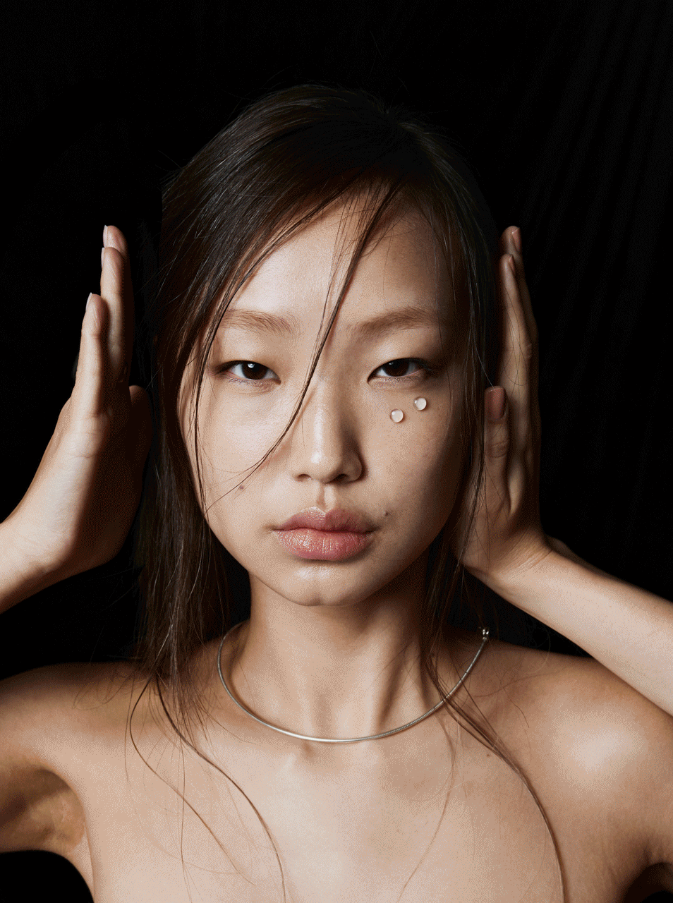
B : Lab
Brand Identity Development
JAN-AUG 2024.
B_LAB was launched in 2013 as a natural beauty concept. Since 2020, it has stood out as 'K-Beauty' in the global market centered on Amazon, and its sales are growing rapidly, especially in the North American market.
However, there is currently no differentiated and clear brand identity for B_LAB, so we developed a consumer-oriented brand identity that is close to ingredients and facts, rather than general and pedantic beauty branding, targeting the year 24/25, when explosive growth is expected.
B_LAB 은 2013년 자연주의 뷰티 콘셉트로 론칭 되었습니다. 2020년부터 아마존을 중심으로 글로벌 시장에서 ‘K-Beauty’로 두각을 나타내고 있으며 특히 북미 시장에서 그 매출은 급성장하고 있습니다.
하지만 현재 차별화되고 명확한 B_LAB 만의 브랜드아이덴티티가 부재하여 폭발적인 성장이 예상되는 24/25년도를 타깃으로 일반적이고 현학적인 뷰티 브랜딩이 아닌 원료 와 사실에 근기한 소비자 중심의 브랜드 아이덴티티를 개발하였습니다.
Project Strategy
The cosmetics brands that currently stand out in the domestic market were characterized not by pedantic and philosophical branding, but by a clear and intuitive direction, presenting the usability and benefits of the brand in a consistent language and design to clearly show consumers why they should use it.
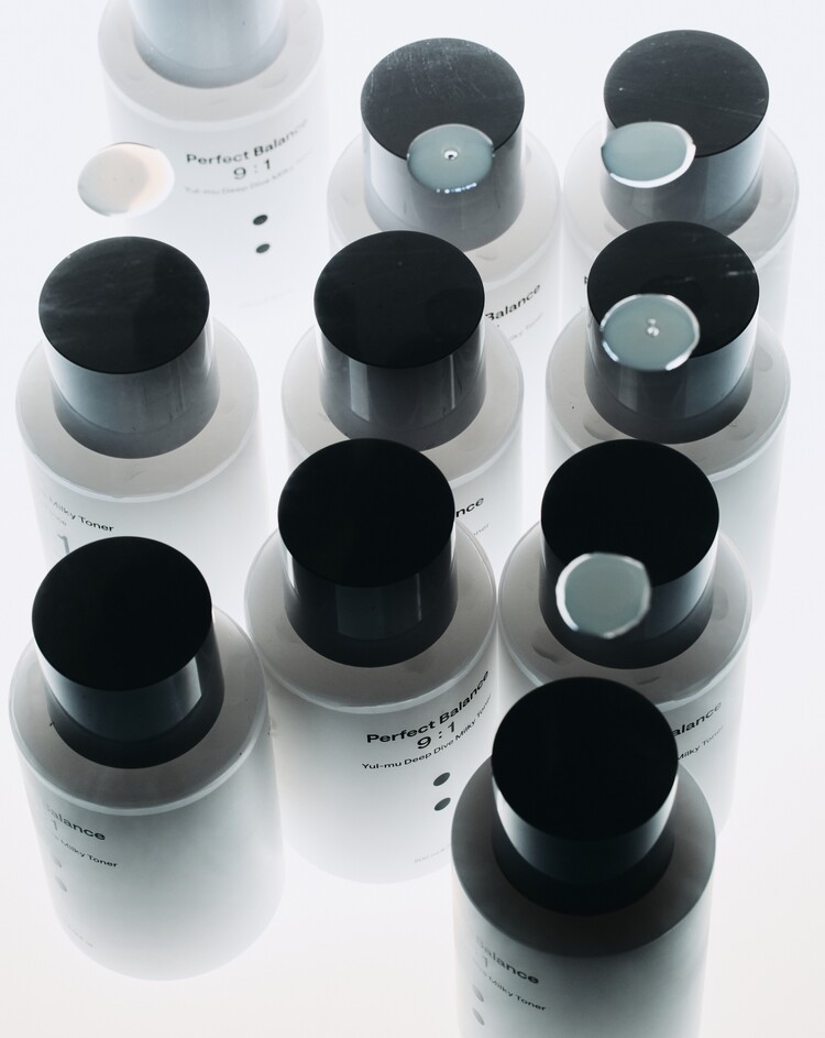
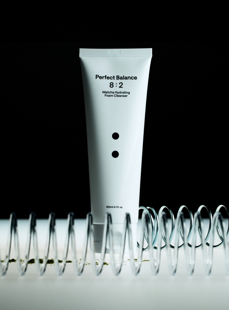
After identifying these commonalities, the brand strategy keyword that we derived from our communication with the brand was “optimal balance of ingredients and ingredients,” and we decided not to follow the trend of dividing ingredients into black and white and emphasizing only the benefits. We repositioned the brand as a brand that understands the strengths and weaknesses of each ingredient and raw material and studies the balance of raw materials and ingredients for optimal effects, rather than just selling temporary attention.
현재 국내 시장에서 두각을 보이는 코스메틱 브랜드의 공통점은 현학적이고 철학적인 브랜딩이 아닌, 명확하고 직관적인 방향에 따라 일관된 언어와 디자인으로 브랜드의 사용성과 장점을 제시함으로써 소비자로 하여금 사용해야 하는 이유를 명확하게 제시하는 것이 특징이였습니다.
이러한 공통점을 확인한 우리는 브랜드와의 커뮤니케이션을 통해 도출해낸 브랜드 전략 키워드는 ‘원료 및 성분의 최적 밸런스’ 였고, 트랜드를 쫓아 성분을 흑백으로 나누고 장점만 부각시켜 판매하는 일시적 이목을 끄는 것이 아닌 각 성분 및 원료가 가지고 있는 장담점을 파악하고 최적의 효과를 내기 위한 원료와 성분의 밸런스를 연구하는 브랜드로써 리포지셔닝을 진행하였습니다.
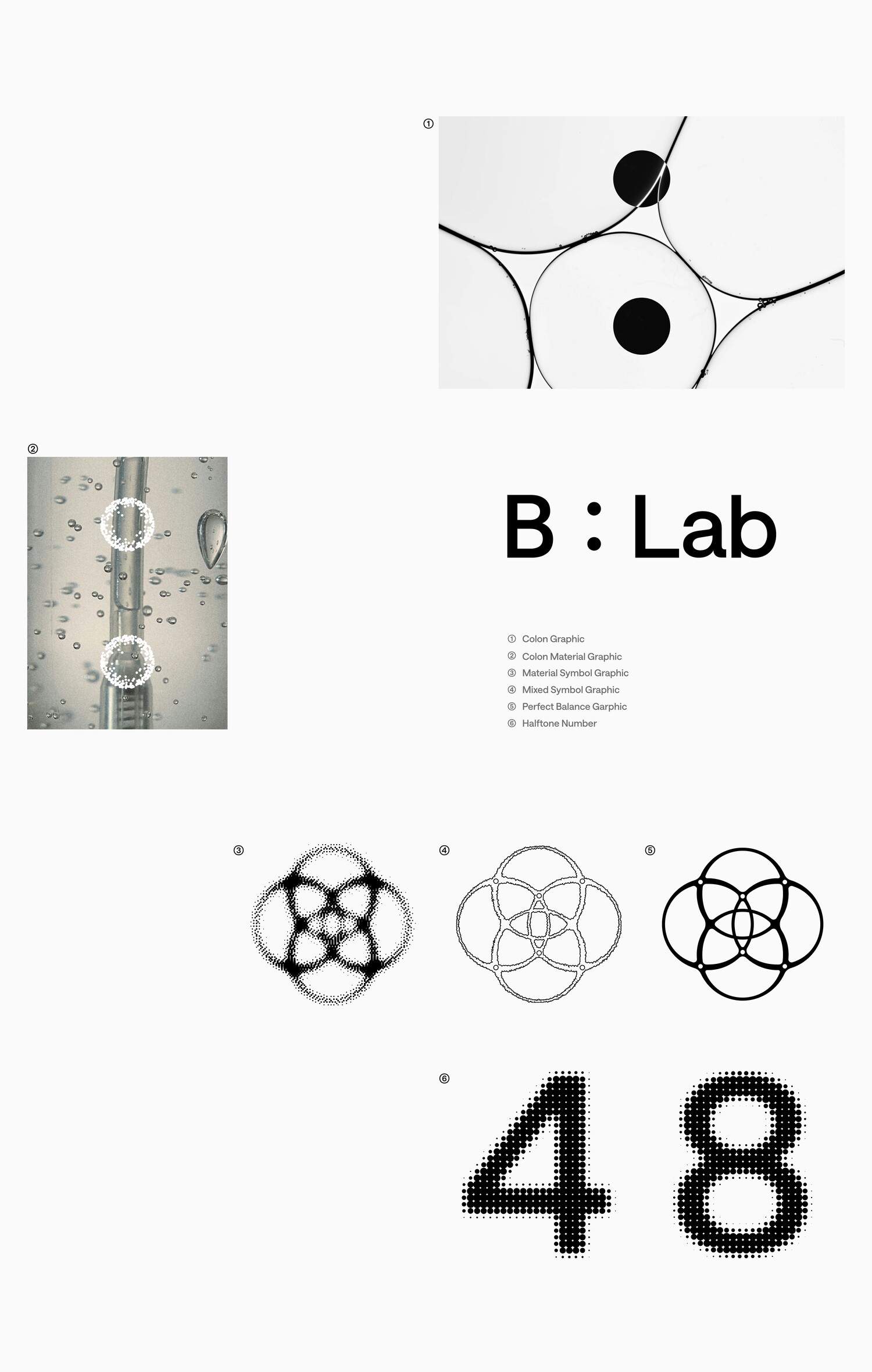
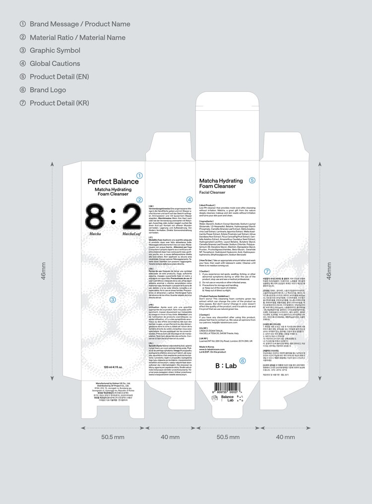
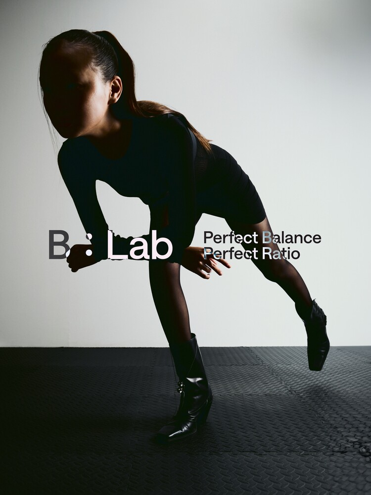
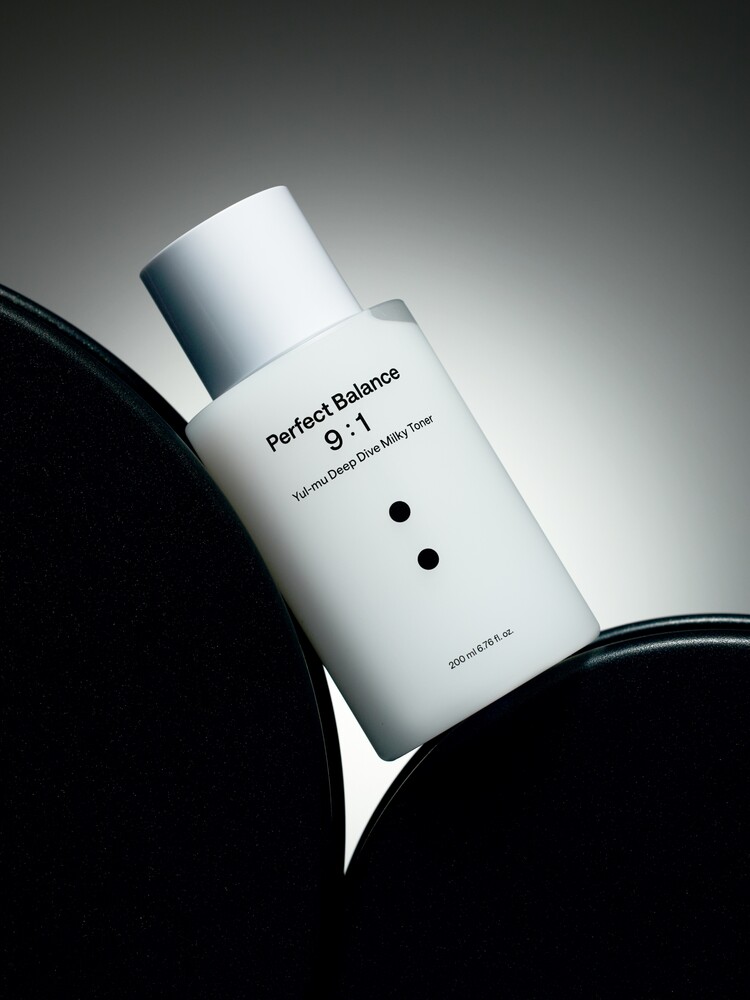
Brand Logo
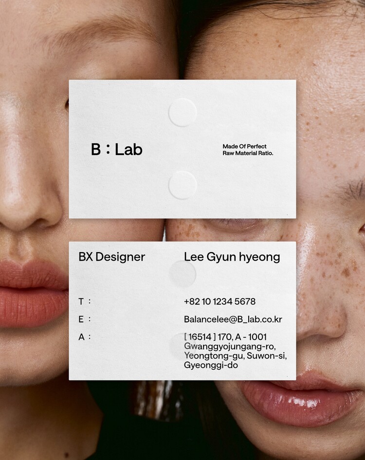
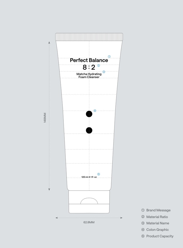
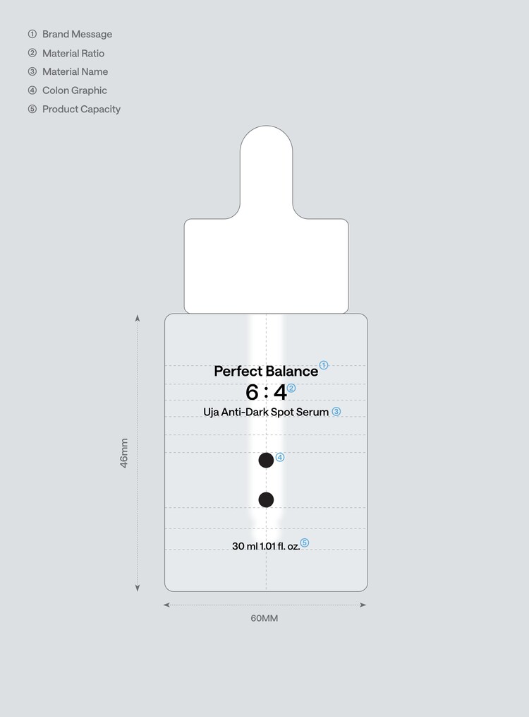
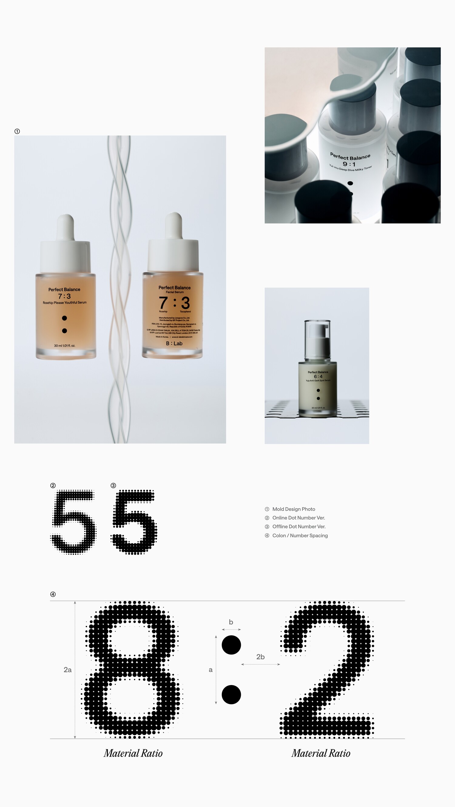
By inserting the colon ' : ', which symbolizes the ratio, instead of the underbar form that connects the 'B' and 'Lab' in the existing logo, we designed the brand logo to convey the value of the brand that metaphorically researches the optimal ratio to consumers.
We designed the area of the two margins centered on the colon in accordance with the 1:1.6 ratio, which is referred to as the 'golden ratio', and devised a flexible system that can respond to various environments, so that it can be used comprehensively for various contents.
기존 로고의 ‘B’와 ‘Lab’을 연결요소로 사용하던 언더바 형태 대신에 비율을 상징하는 콜론 ‘ : ’을 삽입함으로써, 소비자들에게 은유적으로 최적의 비율을 연구하는 브랜드만의 가치를 전달 할 수 있도록 브랜드 로고를 설계했습니다.
콜론을 중심으로 양 여백의 영역을 '황금비율'이라 일컫는 1:1.6비례에 맞춰 설계하고 다양한 환경에서 반응이 가능한 플랙서블 시스템을 고안하여 다양한 컨텐츠에 포괄적으로 활용이 가능하도록 디자인했습니다.
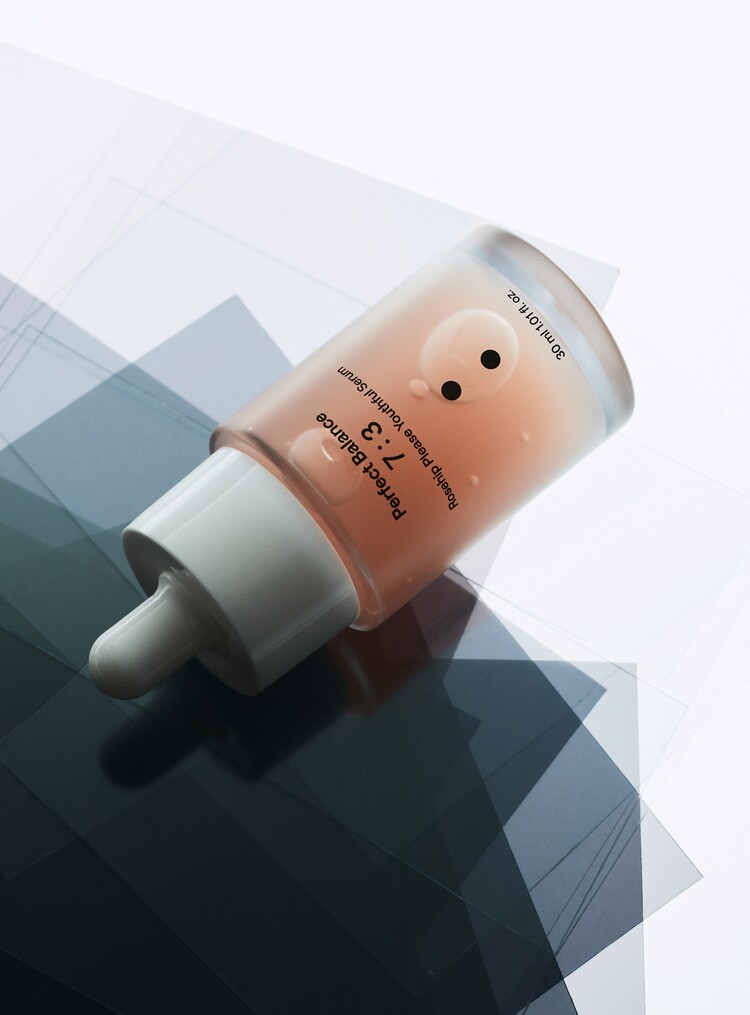
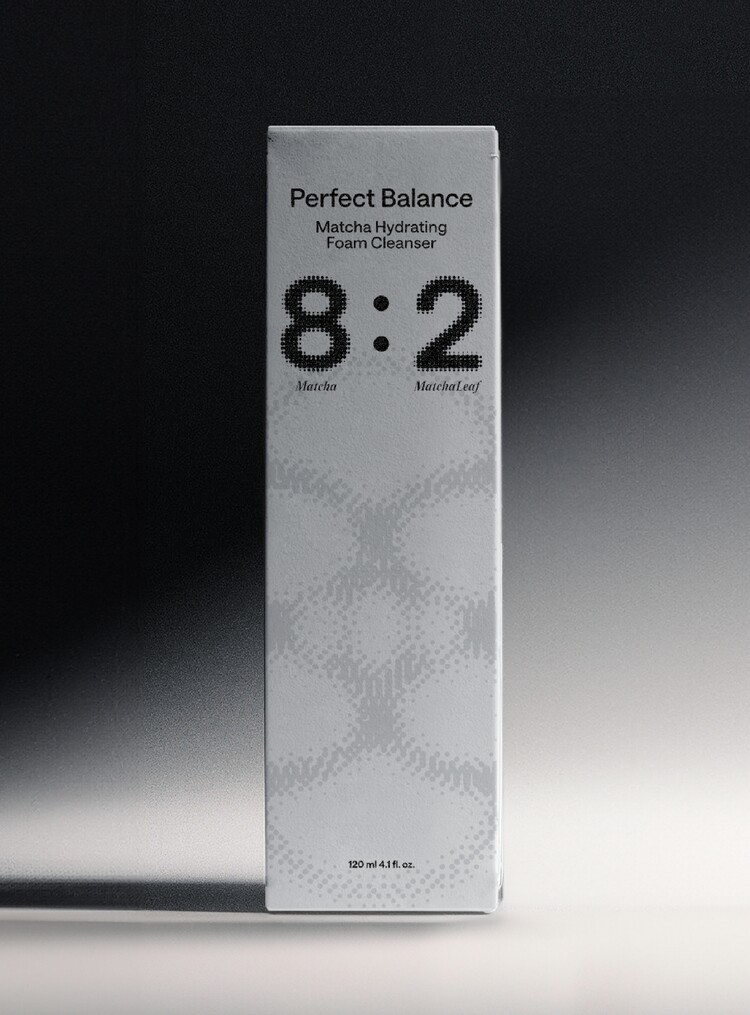
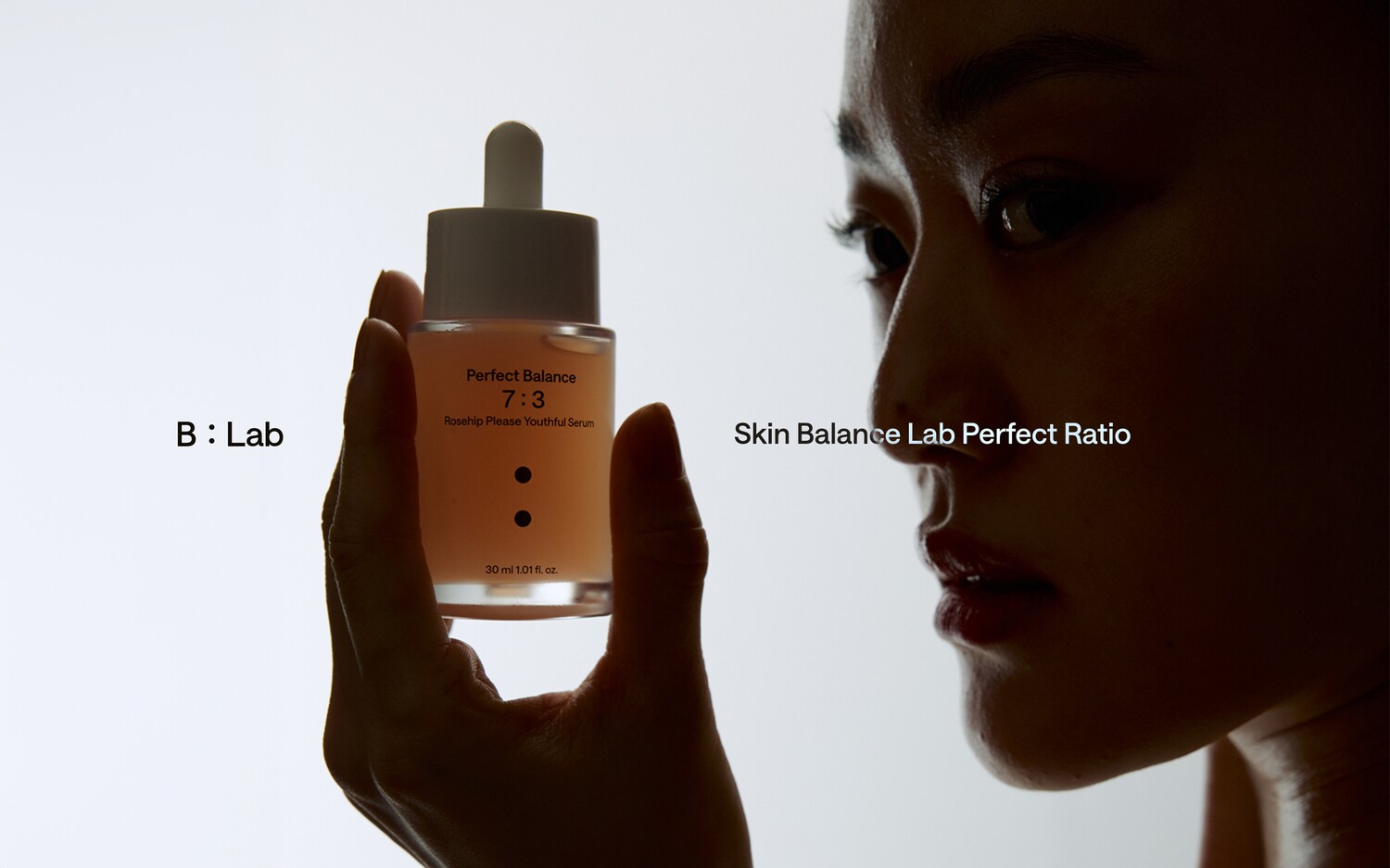
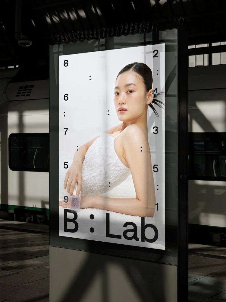
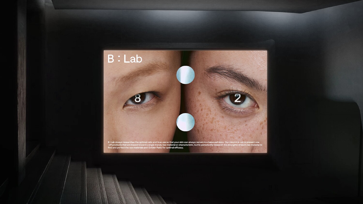
Graphic Language
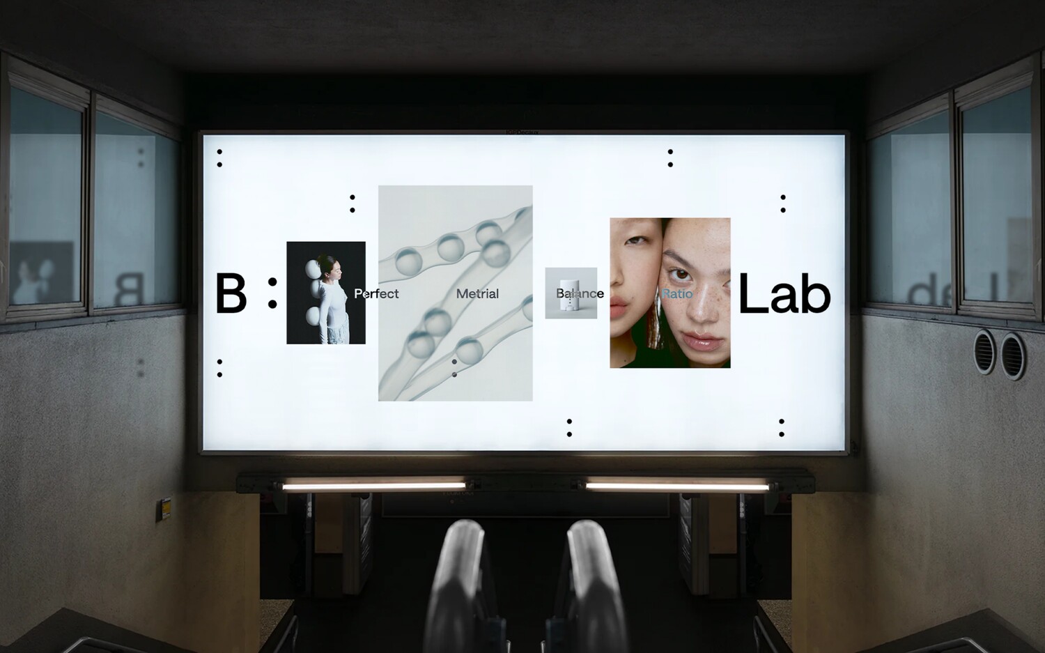
B: Lab's graphic language is based on the colon, which represents a ratio, and is expressed in various graphics as a 'skin balance lab' brand that defines the optimal balance of ingredients. The graphic language based on the colon, including numbers and graphic symbols, is an expression method that can capture the direction and values that the brand pursues.
By proposing a graphic language with various expansion possibilities, we developed a graphic language that allows the brand to communicate with consumers in a consistent but diverse graphic language to increase recognition.
B : Lab의 그래픽 언어는 최적의 성분 밸런스를 정의하는 ‘피부 밸런스 연구소’ 브랜드로써 비율을 나타내는 콜론을 기본으로 이용하여 다양한 그래픽으로 표현합니다. 숫자와 그래픽 심볼등 콜론을 기본으로 형성된 그래픽 언어는 브랜드가 추구하는 방향성과 가치를 담아낼 수 있는 표현 방식입니다.
다양한 확장 가능성이 있는 그래픽 언어를 제안함으로써, 브랜드가 소비자에게 일관되지만 다양한 그래픽 언어로 소통 할 수 있도록 개발하여 인지력을 높일 수 있도록 디자인하였습니다.
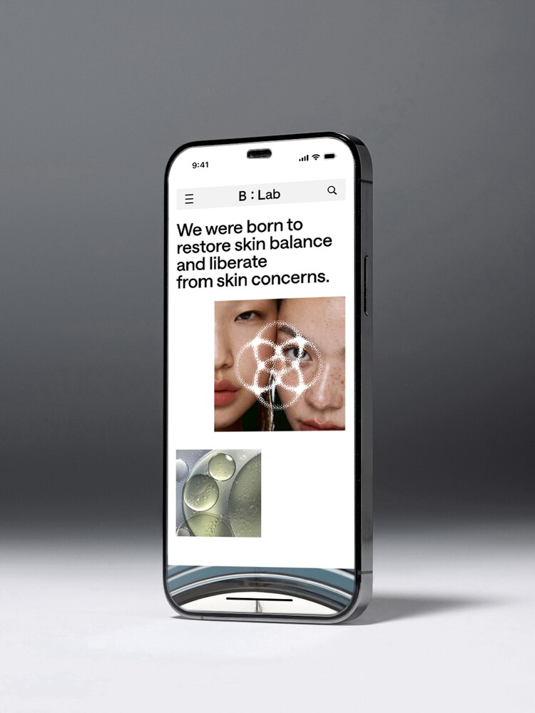
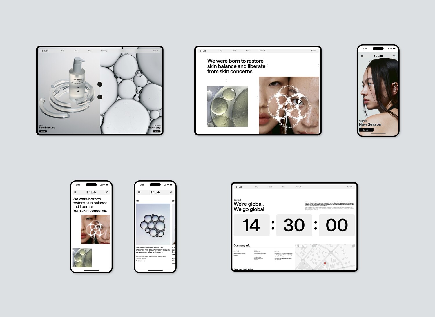
Web Site Design
B: Lab's website was designed to communicate the brand's new messaging to a global audience, while also facilitating purchases across multiple global sites. The website was responsive, so it looks the same on mobile or PC, and was designed to match the brand's messaging, with iconic colon graphics and imagery throughout.
B : Lab의 웹 사이트는 글로벌 사용자를 대상으로 브랜드의 새로운 메세지를 전달함과 동시에, 여러 곳의 글로벌
사이트에서 구매가 용이하도록 웹 사이트를 기획하였습니다. 또한 반응형으로 제작하여, 모바일이나 PC에서도 동일한 룩으로 보여질 수 있도록 하였고, 곳곳에 브랜드를 상징하는 콜론 그래픽과 이미지를 사용하여 브랜드가 전달하고자 하는 메세지에 맞게 디자인 하였습니다.

B:Lab
Brand Identity Development
BX Design
Tomnick.Inc
Strategy Director
Kim Dong Wan [Tom]
Creative Director
Hong Hyun Doo [Nick]
BX Designer
Lee Min Seok [Ethan]
Hwang Sun Wook [Sun]
Client
GFPROJECT.Inc.